PROBLEM
Cappex has over 600 college clients. We help colleges find the right students to fill their upcoming freshmen classes. Our outdated method of sending students college matches was through direct emails. Out of the 9% of emails that would get opened, only 5% of the 9% would interact with the email and accept the match.
QUESTIONS
How do we build a seamless experience on our platform to increase client inquiries?
How do we show students colleges based on their personal preferences and interests?
How do we encourage students to add schools to their college list and interact with colleges that would be a good fit for them?
SOLUTION
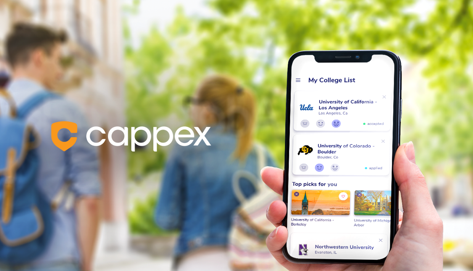
Designing a college matchmaker feature inspired by modern dating apps like Hinge and Tinder.
PROCESS
My process included researching modern dating apps and finding inspiration on how to display a person (or in this case a college) to a student. I started with wireframing out different types of copy, the number of colleges displayed, and where to put the matches on our site. I placed them on the homepage and started with 10 college matches per day. The matches would be displayed if they were both a good match for the school and a good match for the student based on their personal preferences.
ITERATION
We shortened the height of the homepage to get matches above the fold and increased the college matches to 30 per day.
RESULTS
By leaning into interaction mechanics which resonate with high school and college students, the college matchmaker feature was the primary contributor to a 40% increase in the number of client inquiries per student.
Wireframes
MVP Matches
Custom Matches
Other Areas of Focus
Throughout my time at Cappex, I always thought of the student first. What would my 16-year-old-self want when looking for a college? Choosing a college is one if not THE biggest decisions of your pre-adult life, and I wanted to make this journey as painless as possible.
In order to achieve that, I added gamification to the site to make to-do list items fun and action-oriented, incorporated personable gender-fluid & inclusive illustrations, and was consistently updating the user journey based on a high schoolers age, goals, and where they were in the college search.
Gamification
User Journey & Student Research
Illustrations